ใน ep นี้ เราจะมาวิเคราะห์ Customer Segment สอนทฤษฎี Machine Learning การแบ่งกลุ่มลูกค้า Customer Segmentation หรือ Market Segmentation หลักการ สร้าง Segment Profile กลุ่มลูกค้า, Customer Profile ด้วย K-Means Clustering ซึ่งเป็น Machine Learning แบบ Unsupervised Learning เป็น Algorithm ที่เรียบง่าย และนิยมใช้ใงาน Customer Relationship Management, Business Model Canvas
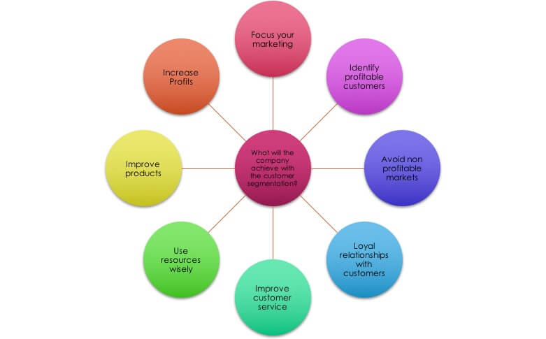
Customer Segmentation คืออะไร
Customer Segmentation หรือ Marketing Segmentation คือ การแบ่งกลุ่มลูกค้าเป็นกลุ่มย่อย ที่สมาชิกมีคุณลักษณะคล้าย ๆ กัน Customer Segmentation เป็นเครื่องมีอสำคัญ ที่นักการตลาดใช้ในการระบุความต้องการของกลุ่มลูกค้า ที่ถูกมองข้ามไป ยังไม่ได้รับการตอบสนอง การใช้ข้อมูลเหล่านี้ทำให้องค์กรธุรกิจสามารถเอาชนะคู่แข่ง ด้วยการพัฒนาสินค้า และบริการพิเศษ ที่ตอบสนองลูกค้าเฉพาะกลุ่ม
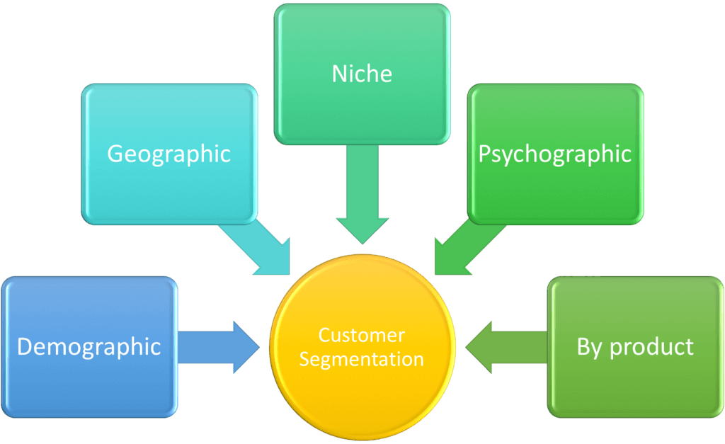
ตัวอย่างวิธีการ Customer Segmentation ยอดนิยม หลักการวิเคราะห์ ที่ธุรกิจใช้ในการแบ่งกลุ่มลูกค้า Market Segment, Customer Persona, Customer Avatar มีดังนี้
- Customer Segmentation ด้วยสถิติประชากร Demographic เช่น เพศ gender, อายุ age, ลักษณะของครอบครัว familial, กรรมพันธุ์ racial, ชาติพันธุ์ ethnic group และสถานะสมรส marital status, รายได้ income, การศึกษา education, อาชีพ occupation
- Customer Segmentation ด้วยข้อมูลภูมิศาสตร์ Geographical ที่มักแตกต่างกันใป ในแต่ละภาคธุรกิจ บางธุรกิจ อาจจะเน้นเฉพาะพื้นที่ หรือเมืองบางเมือง สำหรับธุรกิจขนาดใหญ่ อาจจะมองภาพรวมทั้งประเทศ หรือทวีป
- Customer Segmentation ด้วยลักษณะจิตวิทยา Psychographics เช่น ฐานะทางสังคม social class, ไลฟ์สไตล์ lifestyle, และ อุปนิสัย บุคลิกภาพ personality traits
- Customer Segmentation ด้วยข้อมูลพฤติกรรม Behavioral data เช่น การนิสัย พฤติกรรมการจับจ่ายใช้สอย การบริโภค spending and consumption habits, การใช้งานสินค้า และบริการ product/service usage, และประโยชน์ใช้สอยที่ได้รับ desired benefits.